INTRODUCTION
Tools
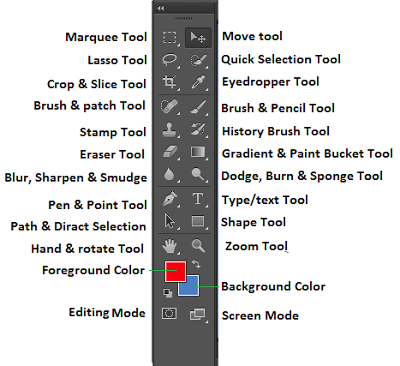
Photoshop has all the standard tools of an image editor (like the Move, Text and Shape tools), but also includes all these specialist tools that we learnt how to use.
- Marquee: Selecting rectangular sections of a layer.
- Lasso: Cutting out random shaped sections of a layer.
- Quick Selection: selecting areas of a certain colour/texture that is recognised by the software.
- Blur (etc.): smudges, blends and adds texture to layers.
- Eyedropper: selecting specific colours featured in a layer.
- Gradient/PaintBucket: fills a selected area with a colour or colour gradient.
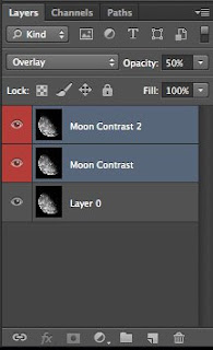
 We also learnt about how layers work within a project and how to see/un-see layers (click the eye icon on & off) and the key fact of having to select the specific area that you want to edit.
It was important for us to understand the basics of opening, saving and copy & pasting files within Photoshop. As well as this, the simple manipulation of images is a key part to the general photoshop process. For example, to change a picture's size - Edit > Transform > Scale - or to change the picture's colour parameters - Image > Adjustments.
CONSTRUCTING AN ALBUM COVER
Concept
I decided to make an album cover for a track I had made with a Grime rapper, called "3 Strokes". My concept revolved around three thick paints smudges/strokes that I searched on google images for. After a few minutes of searching I decided on this single pain stroke graphic that had no background (which was a bonus as I didn't have to cut the smudge out of the image). I imported the large jpeg file into photoshop and changed the hue to turn the originally pink paint stroke to turquoise just because it was the best looking colour for this graphic. I then duplicated this layer two other times, and arranged the strokes like below.
\/ \/ \/ \/ \/
Then I used the online Adobe Colour wheel (https://color.adobe.com/create/color-wheel/) to choose a colour scheme...
I decided that pink/magenta would be the best colour to compliment the turquoise strokes.
I then used the Text tool to write the three phrases "3 Strokes", "Genranon" and "feat. ETI" as separate layers. I selected a script-like font and a magenta colour for the text. I then stretched the text using the text arc tool to make it look more random and flowing with the stroke. I then rasterised the text layers so that I could smudge the to look like they had been painted over.
Then I searched for a paper like texture on google images, to use as a background, and found a high resolution image of old paper. I darkened the image to almost black using the image adjustment settings.
I wanted to add some sort of lighter border to this as a background. To do this I selected a square, slightly smaller than the layer, using the marquee tool. I then filled this area with a circular gradient of black at the edges to transparent in the centre. Using a large radius smudge tool, I then smudged the edges of this section into the lighter border, leaving this effect...
Finally, I organised all the layers...
... to produce this final product...
ANALYSIS OF FINAL PROCESS & PRODUCT
What I have learnt:
- Using a well calculated colour scheme throughout the digi-pack keeps everything related and in unison which further engrains the artwork into the listener's mind.
- Featuring common themes and fonts, throughout the digi-pack, creates an entire combined product that resonates better with the audience.
- I good idea for future constructions would be to create brainstorm diagrams and draft sketches to develop the idea as much as possible before starting the construction process.
- Featuring conventions of the genre of the music will spark the idea of the genre in the viewer's head, allowing the artwork to advertise more appropriately and resonate with the listener.
- This artwork is for an electronic dance music collaboration between a DJ and a grime rapper, and I feel that it would be a good idea to create a digi-pack that maybe features the artists featured.
- Addressing the target audience (of 16-25 in this case) is very important.
- It is also important to clearly present the artist(s) as either synthetic or organic. (My artwork is too much of a mixture of both).
I think that my design was very successful for a first try. I like the colour scheme I used and the feature of paint stroke graphics, but I would prefer the design if it was of a higher quality as my inexperience really shows through.


No comments:
Post a Comment